Color isn’t just decoration—it’s a language that speaks directly to your emotions. When thoughtfully applied, it can transform your home from a collection of rooms into a harmonious, flowing space that feels personal, comfortable, and inspired. But choosing the perfect color palette isn’t just about selecting pretty shades. It requires an understanding of design principles, space dynamics, and the subtle psychological power of color.
Let’s explore how to make confident, informed choices that will bring out the best in every room of your home.
Why Color Matters in Interior Design
Color influences more than just how a room looks—it shapes how it feels. The emotional impact of color is profound and often subconscious. Warm hues like reds and oranges tend to energize and stimulate conversation, making them ideal for social areas. Cool tones such as blues and greens evoke calmness, perfect for bedrooms or reading nooks.
What’s also fascinating is how lighting interacts with color. A sunny room may enhance warm tones, making them feel more vibrant, while dim artificial light may mute a color’s impact or alter its tone completely. This relationship between light and color perception is essential to understand when beginning any design process.
Key Factors to Consider Before Choosing a Color Palette
Before you fall in love with that deep forest green or that whisper-soft beige, consider the broader picture. A room’s function should guide your choices: what activities take place there? Is it meant to energize or relax? Equally important is the natural light that filters in throughout the day—southern exposure tends to bring out the warmth in colors, while northern light may cool things down.
Also, look at the permanent elements in your home such as flooring, cabinetry, and large furniture pieces. These elements are often costly or impractical to change, so your color choices need to work in harmony with them. While it’s tempting to chase trends, your personality and comfort should always take the lead. A home should reflect who you are, not just what’s in fashion.
Color Palette Basics: Understanding the Color Wheel
Understanding the foundational principles of the color wheel empowers you to make smart, cohesive decisions. At the heart of it are three categories: primary colors (red, blue, yellow), secondary colors (green, orange, purple), and tertiary blends in between.
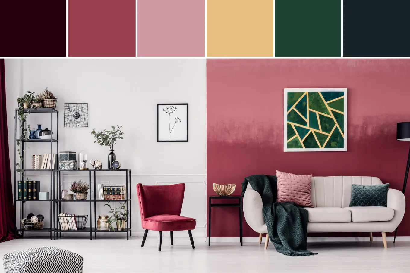
Colors are generally divided into warm (reds, oranges, yellows) and cool (blues, greens, purples) tones. Each has a psychological and spatial impact. Warm tones can make large spaces feel cozier, while cool tones can open up small, enclosed areas. Color schemes like monochromatic (variations of a single hue), analogous (colors next to each other on the wheel), or complementary (colors opposite on the wheel) offer different moods and levels of contrast.
Choosing Colors for Each Room in Your Home
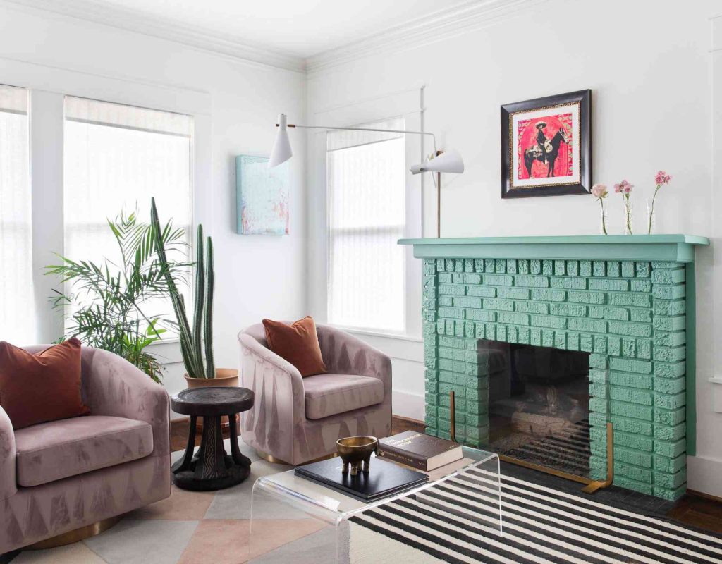
Each room in your home serves a distinct purpose, and the color palette should support that function. The living room, often the social hub, benefits from versatile tones—think soft taupes, earthy greens, or warm greys that invite conversation without overpowering the senses.
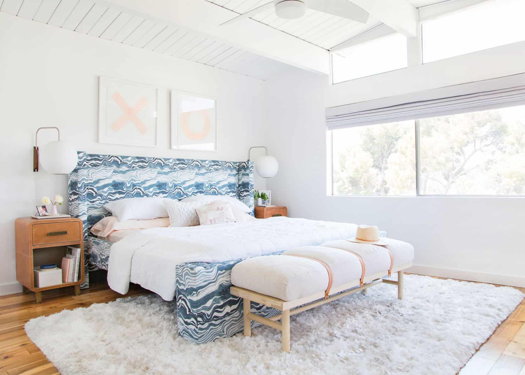
In the kitchen, where energy and cleanliness are essential, lighter, fresher tones like whites, pale yellows, or sage greens can enhance both mood and appetite. Bedrooms are best served by calming, restful shades. Soft blues, muted lavenders, or blush-toned neutrals provide a soothing atmosphere for sleep and relaxation.
Bathrooms feel more luxurious and serene when adorned in light, airy tones such as seafoam, ivory, or sky blue. In the home office, you’ll want hues that enhance focus and productivity—think slate grey, deep green, or even a crisp white paired with darker accents.
Children’s rooms offer a great opportunity to play with cheerful and adaptable tones. Colors can be bright but not overwhelming—like soft coral, powder blue, or sunflower yellow. For transitional areas like hallways and entryways, opt for colors that bridge rooms effortlessly. Warm whites or gentle greys create an inviting passage and help unify the overall home palette.
How to Create a Cohesive Color Flow Throughout the Home
A well-designed home doesn’t feel like a series of disconnected themes—it flows, room to room, with an intuitive sense of continuity. This doesn’t mean every wall should be painted the same color. Instead, use transitional shades to connect spaces. If your living room features a warm sand tone, you might echo that warmth in the hallway with a beige or soft gold.
Repeating accent colors—perhaps in pillows, artwork, or rugs—can tie rooms together visually, even if their main wall colors differ. For open-plan spaces, use subtle shifts in tone or finish to define zones without abrupt changes that interrupt the visual harmony.
Common Mistakes to Avoid When Choosing Colors
Many homeowners fall into the trap of choosing paint colors in isolation. Without testing them in the actual room under different lighting conditions, it’s easy to misjudge their true effect. Undertones—those subtle hints of color beneath the surface—can clash with existing elements if not properly considered.
Another common mistake is overcommitting to bold, saturated hues. While they may look exciting on a paint chip or in a magazine, they can quickly become overwhelming on a large scale. Start with a more neutral base and introduce boldness through accents instead. Most importantly, always test several samples before making a final decision, as colors can behave differently on your walls than they do in the store.
Tools and Resources to Help You Decide
Technology offers some handy helpers when you’re trying to visualize your home’s new look. Online color palette generators, such as Coolors or Adobe Color, allow you to experiment with combinations before you commit.
Several mobile apps now let you virtually apply paint to a photo of your room, so you can see how different colors interact with your space. If the process still feels overwhelming, consider hiring a professional color consultant. A trained eye can often see possibilities—and potential pitfalls—that you might miss.
Final Tips for a Flawless Color Palette
Before you pick up a paintbrush, start by gathering inspiration. Create a digital or physical mood board with images, fabrics, and even nature elements that speak to your desired atmosphere. Don’t rush the process. Allow yourself time to sit with your color choices, view them at different times of day, and adjust based on how they make you feel.
And finally, trust your instincts. Your home should feel like an extension of yourself. If a particular hue brings you joy, confidence, or calm, it’s likely the right choice for you—regardless of trends or conventions.